
Choosing the perfect paint color for your home can be a daunting task, but understanding color theory can simplify the process. Color theory is the foundation of how colors interact, complement, and contrast with each other. By grasping the basics of color theory, you can make informed decisions that enhance the aesthetic appeal of your living spaces. From selecting the right shade to understanding the impact of lighting, these insights can transform your home into a harmonious and visually appealing environment.
Understanding the Color Wheel
The color wheel is a fundamental tool in color theory, illustrating the relationships between primary, secondary, and tertiary colors. Primary colors—red, blue, and yellow—are the building blocks of all other colors. Secondary colors, such as green, orange, and purple, are created by mixing primary colors. Tertiary colors result from combining primary and secondary colors. Familiarity with the color wheel helps in selecting complementary colors, which are opposite each other on the wheel, to create vibrant and balanced color schemes.
The Psychology of Color
Colors have a psychological impact, influencing mood and perception. Warm colors like red, orange, and yellow can evoke feelings of warmth and energy, making them ideal for social spaces like living rooms and kitchens. Cool colors such as blue, green, and purple promote calmness and relaxation, suitable for bedrooms and bathrooms. Understanding these psychological effects can guide your paint choices to create the desired atmosphere in each room.
The Role of Undertones
Undertones are the subtle hues that lie beneath the primary color of the paint. They can significantly affect how a color appears in different lighting conditions. For instance, a beige paint with pink undertones may look different in natural versus artificial light. Identifying undertones is crucial to ensure that the paint color aligns with your vision and complements other elements in the room, such as furniture and flooring.
The Impact of Lighting
Lighting plays a pivotal role in how paint colors are perceived. Natural light changes throughout the day, affecting the appearance of colors. North-facing rooms may have cooler light, while south-facing rooms receive warmer light. Artificial lighting, including incandescent, fluorescent, and LED bulbs, also alters color perception. Testing paint samples in different lighting conditions can help you choose a color that looks appealing at all times.
Creating Color Harmony
Color harmony involves selecting colors that work well together to create a cohesive look. Monochromatic schemes use variations of a single color, offering a subtle and sophisticated appearance. Analogous schemes combine colors that are next to each other on the color wheel, providing a serene and comfortable feel. Complementary schemes, using colors opposite each other, create a dynamic and vibrant contrast. Understanding these schemes can help you achieve a balanced and harmonious design.
Choosing the Right Finish
The finish of the paint affects both the appearance and durability of the color. Flat or matte finishes offer a non-reflective surface, ideal for hiding imperfections but less durable in high-traffic areas. Satin and eggshell finishes provide a slight sheen, making them suitable for living rooms and hallways. Semi-gloss and gloss finishes are highly durable and reflective, perfect for kitchens and bathrooms. Selecting the right finish ensures that your paint choice meets both aesthetic and functional needs.
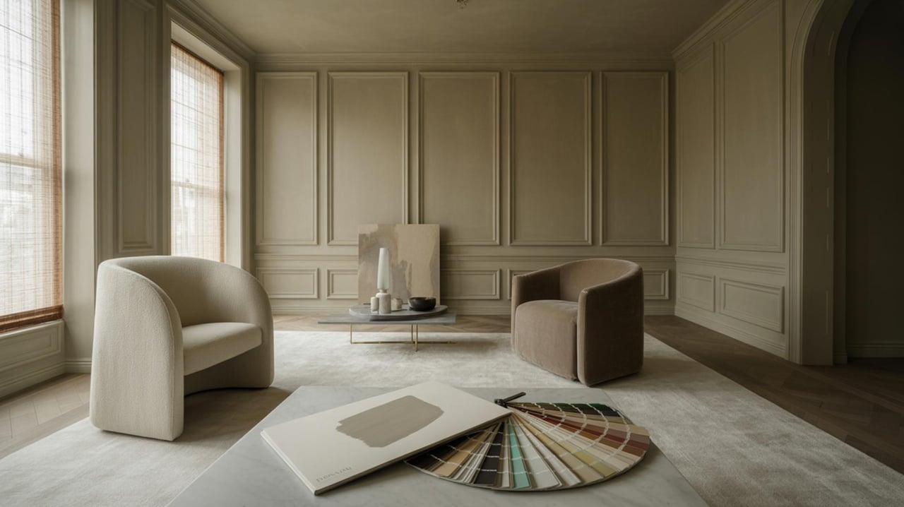
Testing Paint Samples
Before committing to a paint color, testing samples on your walls is essential. Paint small sections in different areas of the room to observe how the color interacts with lighting and other elements. This step allows you to see the true color in your space and make adjustments if necessary. Testing multiple shades can also help you find the perfect hue that aligns with your vision.
Considering Room Size and Function
The size and function of a room can influence your paint color choice. Lighter colors can make small spaces feel larger and more open, while darker colors add coziness and intimacy to larger rooms. The function of the room also plays a role; for example, a home office may benefit from calming blues or greens to enhance focus and productivity.
Coordinating with Existing Decor
When selecting paint colors, consider the existing decor and furnishings in your home. The color should complement furniture, artwork, and accessories to create a cohesive look. Neutral colors offer versatility and can easily coordinate with various styles, while bold colors can highlight specific features or create focal points. Taking into account the overall design scheme ensures that your paint choice enhances the existing decor.
Staying True to Personal Style
Ultimately, the paint color you choose should reflect your personal style and preferences. While trends can provide inspiration, it's important to select colors that resonate with you and create a space where you feel comfortable and at home. Trusting your instincts and embracing your unique taste will result in a personalized and satisfying color scheme that you will enjoy for years to come.
Transform Your Space with the Right Colors
Choosing the perfect paint colors can truly transform your home, creating a space that reflects your personality and style. With these smart tips, you can confidently navigate the world of color theory and make informed decisions. Whether you're refreshing a single room or your entire home, the right colors can make all the difference. For personalized advice and expert guidance, contact Island Pineapple Realty to help bring your vision to life.